
An ecommerce operations KPI dashboard is supposed to catch problems before they hit revenue — but most ecommerce leadership dashboards only report sales, ad spend and conversion rate. Somewhere below that, in a separate tool nobody checks during the Monday meeting, sits a CSAT score and maybe a first-response-time chart.
A head of ops usually finds out the hard way — a refund rate that crept up over a quarter, a warehouse handoff that’s been silently generating duplicate customer messages, a support team closing tickets that reopen three weeks later under a different order number. None of that shows up as a single alarming number. It shows up as a slow erosion that finance eventually notices as margin, not as a support metric.
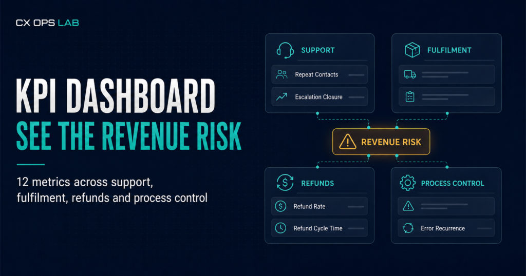
The fix isn’t another isolated tool. It’s a dashboard that groups operational metrics by where the risk actually lives — support, fulfilment, refunds and process control — and reads them together instead of in four separate tabs.
Why departmental metrics hide operational risk
Each function tracks its own numbers for its own reasons. Support watches response time and CSAT. Fulfilment watches ship rate. Finance watches refund percentage as a line item, not a diagnostic. None of these owners is wrong to track what they track — the problem is that the metrics were never designed to be read together, so the connections between them go unmeasured.
A refund spike in week three might trace back to a warehouse packing error in week one that support never flagged as a pattern, because each ticket looked like an isolated complaint. An uptick in repeat contacts might be the earliest signal of a process breakdown — weeks before it shows up as a measurable dip in CSAT. Industry first-response benchmarks for ecommerce sit around four to six hours, with best-in-class operations closer to thirty to sixty minutes, which is a useful reference point, but a single metric in isolation still won’t tell you whether a slow response is a staffing problem or a symptom of an unresolved fulfilment issue generating extra tickets. Ringly
The businesses that manage this well don’t track more metrics. They track the right twelve, grouped so a red flag in one area is checked against the other three before anyone reacts.
The Four Groups Behind an Ecommerce Operations KPI Dashboard That Works
Group 1 — Support
1. First response time. How long between a customer message arriving and a substantive human reply. Track it by channel; email and marketplace messaging behave differently and blending them hides the slower one.
2. Repeat contact rate. The percentage of tickets where the same customer, same order, contacts you again within a set window — commonly seven days. This is the earliest indicator that a resolution didn’t actually resolve anything, and it usually moves before CSAT does.
3. Escalation closure rate. The share of escalated cases — refund disputes, delivery failures, product complaints — closed to resolution rather than abandoned or silently dropped. Across nine months and 9,025 orders on a real multi-platform DTC operation spanning Shopify, Shopee and Lazada, escalation closure held at 95.1%. That number matters less as a target to copy and more as proof that escalation closure is measurable and improvable with a defined workflow, not luck.
Group 2 — Fulfilment
4. On-time ship rate. Orders shipped within the promised window, measured against the promise made at checkout, not an internal SLA nobody customer-facing sees.
5. Fulfilment error rate. Wrong item, wrong quantity, damaged-in-transit or missing components, as a percentage of total orders shipped. Most teams track this at the warehouse level and never connect it to the support tickets it generates downstream.
6. Error recurrence rate. The percentage of fulfilment errors tied to the same SKU, batch or carrier lane within a defined period. A single error is an incident. A recurring one is a process gap, and it’s the metric most dashboards skip because it requires tagging errors consistently, not just counting them.
Group 3 — Refunds
7. Refund rate. Refunds as a percentage of total orders. Treat it as a system-control indicator, not just a cost line — a well-run operation over the same nine-month period held refund rate at 1.71% against approximately $610,000 USD in gross sales, which is the kind of figure that only holds when approval and eligibility decisions are consistent rather than ad hoc.
8. Refund turnaround time. Days from refund request to funds released. Long turnaround doesn’t just frustrate customers — it multiplies repeat contacts, because customers who don’t hear back within a few days assume the request was lost and file a second one.
9. Refund reason code concentration. The share of total refunds attributable to your top three reason codes. If one code dominates, the fix is usually upstream — a product issue, a sizing chart, a fulfilment habit — not a support training issue.
Group 4 — Process control
10. Approval override rate. How often refund or exception decisions bypass the standard approval path. A rising override rate almost always means the documented process doesn’t match what the team actually needs to do, which is a documentation problem wearing a compliance costume.
11. Handoff lag time. The delay between a warehouse status change — a delay, a damage report, a stock correction — and that information reaching the person actually talking to the customer. Long lag is what produces the specific failure mode where support tells a customer one thing and the warehouse has already made it untrue.
12. Root cause repeat rate. The percentage of resolved issues that recur — same root cause, different order — within 30 or 60 days. This is the metric that separates a team that closes tickets from a team that closes problems.
KPI value is tied directly to the specific goal it’s measuring, and the set worth tracking will differ by business stage and objective — a twelve-metric dashboard is a starting structure, not a fixed template. A solo operator managing a few hundred orders a month doesn’t need the same cadence as a team running multichannel volume, but the four groupings hold at almost any scale because the failure patterns are the same. Extensiv
Ready to see where your own numbers sit against this structure?
Most teams can name one or two of these twelve off the top of their head. Few can say with confidence how repeat contacts, escalation closure and refund turnaround move together over a quarter — which is usually where the actual leak is.
The Professional Operations Health Check walks through your current operating pressure, priority areas and readiness across these same categories, and flags where a structural gap is likely costing more than it looks like on the surface. Requests for the complimentary 30-minute Operations Review are assessed afterward for operational fit — it’s a limited offer, not an automatic booking, but it’s the fastest way to get a second set of eyes on where your numbers actually sit.
Building the dashboard without overbuilding it
A twelve-metric dashboard fails in one of two ways: teams either never build it because it feels like a data project, or they build something so elaborate it takes longer to maintain than the problems it’s meant to catch. Neither is necessary.
Start with data you already have. Every metric above pulls from systems most DTC operations already run — a helpdesk, an order management tool, a fulfilment platform, and a spreadsheet for reason codes if nothing more sophisticated exists yet. The dashboard is a structure for reading numbers together, not a demand for new software.
Set a review cadence before you set targets. Weekly for support and fulfilment metrics, since those move fast. Monthly for refund and process-control metrics, since patterns there take longer to surface and weekly noise can be misleading.
Assign one owner per group, not one owner for the whole dashboard. A single person accountable for all twelve metrics tends to default to whichever group is loudest that week. Four owners, one per group, with a shared review each month, catches cross-group patterns that a single owner misses.
Flag connections, not just numbers. The real value of this structure shows up when a rising number in one group explains a rising number in another — fulfilment errors up, refund reason codes shifting toward “wrong item,” repeat contacts climbing on the same SKUs. Build a habit of checking adjacent groups whenever one metric moves, rather than treating each group as its own silo.
The dashboard is a diagnostic tool, not a report
This is what an ecommerce operations KPI dashboard is actually for — turning a vague sense that “support feels stretched” into a specific, ownable operational gap — a fulfilment error pattern, a refund approval bottleneck, a handoff lag between two teams that don’t talk enough. That specificity is what makes it useful instead of decorative.
If your current setup can’t answer which of these twelve is driving the others, that’s the gap worth closing before adding a thirteenth metric.
Take the Professional Operations Health Check to see where your current metrics — and the gaps between them — actually sit, or move straight to implementation with the CX Operations Complete Toolkit, built for teams ready to structure this dashboard and the workflows behind it without starting from a blank page.
About CX Ops Lab
CX Ops Lab publishes operational frameworks, SOP templates, and case-study content built from real DTC ecommerce operations — not theory. Every framework was pressure-tested during live operational conditions across Shopify, Shopee, and Lazada at $610,000+ USD GMV scale.
Website: cxopslab.io │ Products: payhip.com/CXOpsLab
Pingback: Ecommerce Operations Review: What to Prepare for a Useful 30-Minute Diagnostic Call
Pingback: Ecommerce Issue Taxonomy: Proven Fix for Six Classification Errors Killing Root-Cause Reporting